Minsheng Art Museum, Shanghai.
March 20 to May 3, 2011
Liu Wei’s ‘Trilogy’ at Minsheng Art Museum, Shanghai
Part II — Read Part I of this review here
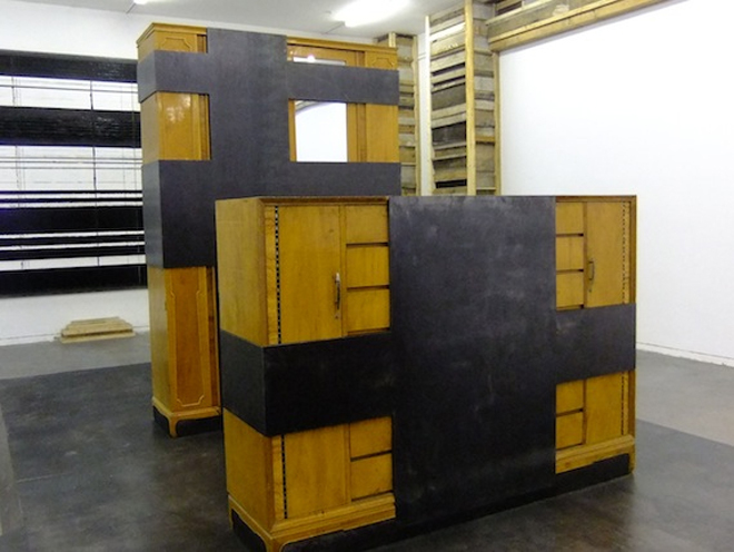
The Gothic flying buttresses seem to have developed, at least partly, out of two series of work: Liu Wei’s composition of recycled windows and doors, “The Outcast,” (2007; also previously shown at Minsheng) and his “Purple Air” paintings. (5) In some ways, the structures are transfigurations of the paintings, themselves a type of transfiguration of the traditional Chinese literati painting first parodied by Liu in “It looks like a landscape” (2004), a black and white photographic series that depicted bare bottoms poking into the air, (in)formally recalling literati mountain landscapes. So it is in part a personal career summary, as is the entire show, but also something else. The work involved in the construction of these exacting models is enormous, yet they are utterly useless, not merely as churches but as structures — one cannot enter them and their theology is indistinct (note the star on top of one of the “steeples,” which might recall either Communism or Judaism’s Star of David—let us note briefly that Karl Marx was born into a Jewish Lutheran family—and also Feininger’s woodcut). The spatial interruptions of “The Golden Section” continue here, with one sculptural island comprising a shiny black “negative space” framed by the same recycled wood and colour scheme of the “cathedrals.” The packing cases and furniture of “The Golden Section,” the “doors” of “Power” are similarly useless and inaccessible.
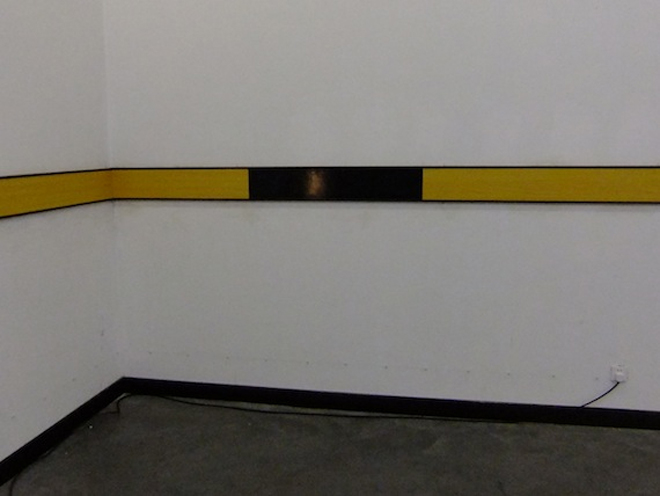
Again we should not let these beautiful relics distract us from the rest of the space. The strip lighting has been judiciously edited by Liu to conform to the horizontal/vertical schema of the sculptures. Around the walls, above head height, runs a line of strip lighting, below that a protective dado board, and a painted line that echoes the horizontals in the “landscape” paintings in the preceding rooms. The dado-board, a strip of wood or metal, sometimes a conduit, that serves to protect walls from being damaged by passing human traffic, provides protection from ordinary life, the artifice emphasised by the trompe l’oeil wooden surface. The cathedrals are thus situated in the artist’s realm of design rather than constituting actual toy cathedrals. Liu’s cathedrals are the result of careful contemplation about these instruments of belief pedagogy. The design is deliberate: this is critique, and not least because exactly what constitutes a cathedral is left undefined.

This installation was initially constituted in Long March Gallery in Beijing in 2010 and later in the recent Shanghai Biennale (see images). This incarnation conforms more closely to the latter. At the opening, the Biennale Director Gao Shiming commented to me that he preferred the first iteration, as it was “less finished,” and he was not the only person to think so. I tend to see the different versions as essential variations on the same theme rather than competing versions. The Long March installation had the aspect of a construction site, an experimental thesis through which one had to carefully tread, whereas the latter variations at the Biennale and Minsheng move closer to synthesis, and in the Minsheng version even the architectural space conforms to the dictates of the “cathedrals.” Colin Chinnery has noted the possible reference to Lionel Feininger’s woodcut print “Cathedral of Socialism” (1919), which appeared on the cover of the Bauhaus Manifesto. (6) Feininger was a member of or associated with numerous expressionist and post-expressionist groups, including Otto Dix’s Dresden Sessionists, Der Blaue Reiter, Die Brucke, and was one of the artists the Nazi’s infamous exhibition of “degenerate art” (Entartete Kunst) in 1937 in Munich. This might simply be trivia but these were core movements in the development of Modernism’s utopias, a fraught, fractured and inevitably unsuccessful enterprise. And inevitably, this leads us to question the fraught and fractured utopias of modern China, from socialism to materialism.
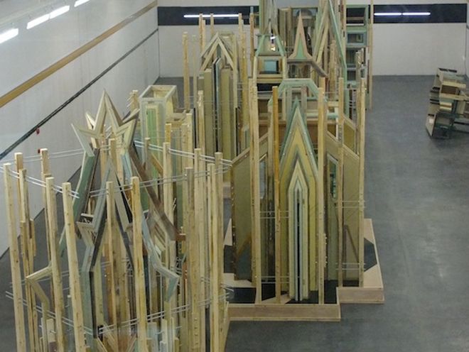

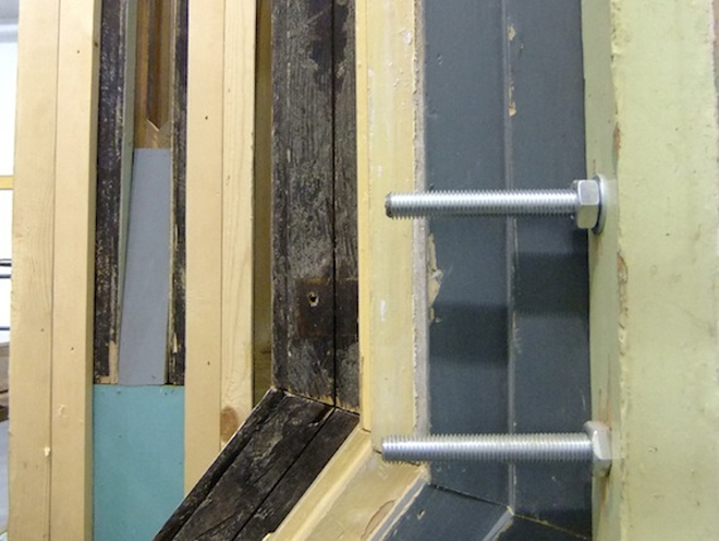
“Merely a Mistake” must also surely be influenced by the installations of Jason Rhodes, not least of all his “Perfect World” of 1999 at the Deichtorhallen Hamburg and a smaller version, “1:12 Perfect World,” at Hauser & Wirth, 2000 in Zurich. “Perfect World” comprised a complex jungle of polished steel scaffolding that filled the enormous 15,000 square-metre Deichtorhallen, with a second floor above the scaffolding comprising a version of the artist’s father’s garden plot but is only viewable by two privileged viewers at any time, courtesy of a hydraulic lift. Whether one is in the scaffolding or perched above the garden, the viewer is always enmeshed in it. “Merely a mistake,” the title so wan and fragile, echoes Rhodes’ scaffolding, with hundreds of bolts holding the structures together, as if just to make sure that belief will still hold. But there is no option for the ordinary visitor to look down upon these cathedrals. Only the curatorial team of the Minsheng has this privilege from their offices above the space, god-like and implacable. These structures are a revenant architecture, strangely revived in a world largely absent the social structures and historical foundations that caused them to come into existence. The complex spires, naves and crypts bear tragic but mute witness to redundant belief systems, zombie philosophies.

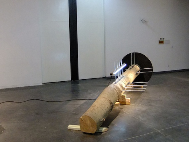
The next room returns to sub-themes. Another giant grey landscape hangs on the wall, this time opposite what is apparently a fallen log power pole (a former tree), with more strip lighting attached to its edge. It would seem that Liu is juggling certain fundamental themes but this installation works more as a pause or rupture before the denouement. Nonetheless, the contrast of paint and sculpture again raises, without resolving, the nature of the relationship between these traditional artistic forms. We must understand the landscapes as solid masses, a visual experience that must be gauged in terms of the weight of the works and their industrial production. But then those lines leak into the museum space, making literal a slippage in mass-communication.

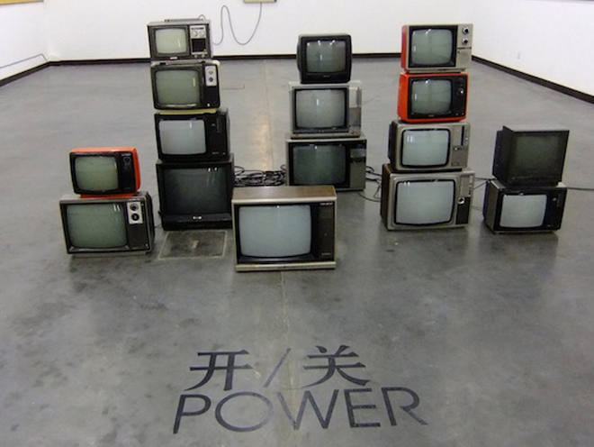
The link is meaningful. Returning to the theme of redundancy (and aren’t power-poles themselves virtually redundant?), the final room introduces “Power,” a pile of old-fashioned box-TVs, each randomly broadcasting an individual line of colour, recalling the landscape paintings, in fact, deconstructing them, and presenting a new sort of painting-as-broadcast, as electronic signal. Undoubtedly this references the television installations of Nam Jun Paik (1932-2006), particularly works like “Zen for TV” (1963-1975), shown at his recent retrospective at Tate Liverpool, where a TV displays, in most versions, a Barnett-Newman-like vertical white line in the middle of the screen. (7) We should not forget here that Nam Jun Paik, with his “Electronic Super Highway,” was one of the sources of the now ubiquitous “information super highway.” (8)

The TVs sit opposite a double door that leads nowhere. The dado strip from the main hall reappears at the entrance to the room, but lower, now at the usual elbow-height and running down to the far end, the end of the line, and where the exhibition does end, with a command to, “Open the door.” Another door, opposite and aligned with the aforementioned hinged-double, is fixed about half a metre off the ground, also with a perpendicular strip-light attached to it, the wire snaking down the wall to the ground. Like the armoire and desk that cannot be used, these doors cannot be opened. If Liu is referring to death, then it is an almost administrative, institutional end, rather than any sort of efflorescence. It seems that each of the scenes we have progressed through equates with a certain site of interaction for the individual. For instance, we might interpret the themes as: “The Golden Section”/personal space, “Merely a mistake”/belief and eidolons; and in the final room, “Power”/ terminations, all aligned and interconnected by the city and communication, verticals and horizontals. But such categorization is merely an interpretation — mistaken? Despite the various lines that draw one to this end, between the “Golden Section” and “Open the Door,” there is no golden thread. Much is left obscure or unsaid. Interpretation is left open. Liu shows us not merely how slippery utopias are — we knew that already — but, far more disturbing, how they cling to us like carbuncles, perversely petrifying and imprisoning us, for finally in “Trilogy” the abyss is human, for as much as “Trilogy” is about human belief there is an eerie absence of them — temples without people, hospitals without patients, televisions without presenters, doors that lead nowhere, desks that are locked, wardrobes that cannot be opened. The horror at the heart of “Trilogy” is that human beliefs so often lack humans.
Read Part I of this review here

Notes
5. Outcast appears also to have heavily influenced Chiaro Shihota’s “One Place“ 2010, window frames recycled from Berlin demolition sites after the Wall fell in 1989.
6. “Colin Chinnery on Liu Wei’s ‘Trilogy’ at Minsheng Art Museum, Shanghai,” May 10, 2011, Art-Agenda Link
7. Though crucially the TV is sitting on its side; in a few versions the TV is horizontal and accordingly the line is also.
8. Nam June Paik, “Media Planning for the Post-Industrial Society — The 21st Century is now only 26 Years Away” (1974), published in Nam June Paik, Werke 1946–1976. Musik – Fluxus – Video, Kölnischer Kunstverein: Cologne, 1976. An abridged version in English was published in 1994 as Electronic Super Highway. Travels with Nam June Paik, New York: Holly Solomon Gallery and Hyundai Gallery, Fort Lauderdale: Fort Lauderdale Museum of Art. Link